Design Process
Overview
- Client: Laidback System
- Industry: Software
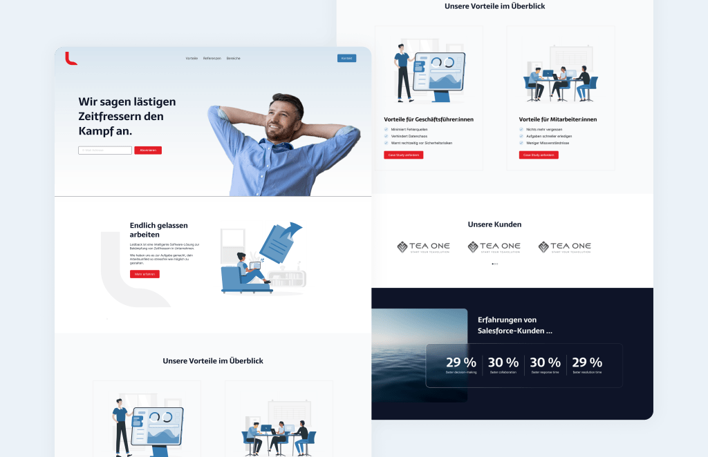
- Objectives: Design a captivating landing page for Laidback Software.
Conceptualization
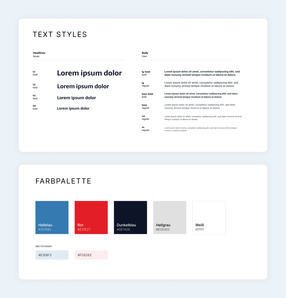
- Striking Color Harmony: Meticulously balanced the use of „Rojo Red“ (#E31E27) for attention-grabbing call-to-action (CTA) elements and „Lapis Lazuli Blue“ (#2A628E) for a tranquil and trustworthy ambiance.
- Efficiency-Centric Design: Ensured the landing page design echoed Laidback Software’s efficiency-driven ethos, offering visitors a hassle-free experience while minimizing time wastage.
Design Iterations
- CTA Brilliance: Iteratively refined the design to amplify the impact of „Rojo Red“ (#E31E27) as the primary color for CTAs, enhancing user engagement and interaction.
- Trustworthy Aesthetics: Fine-tuned the use of „UCLA Blue“ (#357AB1) to instill a sense of trust and reliability in visitors, encouraging them to explore further.

Client Collaboration
- Synergistic Partnership: Worked closely with Laidback Software to align the landing page design with their vision and mission, delivering a page that resonates with their goals effectively.
Testing and Optimization
- Performance-Driven Testing: Rigorously tested the landing page’s performance, ensuring swift load times and seamless user experiences, in line with the goal of saving users valuable time
